
Roots & Spice: Designing a Vegan Frozen Food Brand That Wins the Freezer Aisle
How a chef-lion mascot, an earthy green palette, and a disciplined identity system turned a plant-based frozen food startup into a shelf-ready brand — from first sketch to packaging, stationery, and digital.
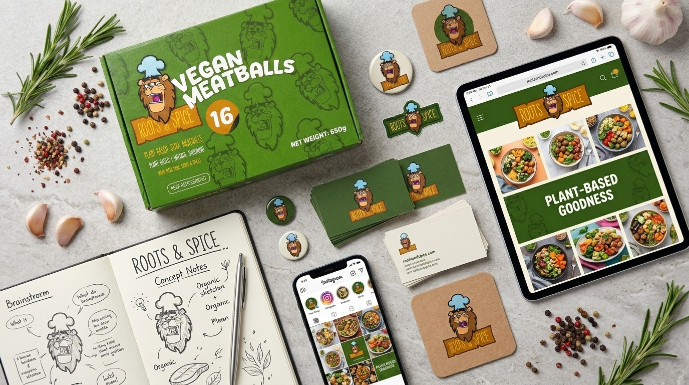
Frozen food is a brutal category to design for. The freezer door is frosted, the lighting is fluorescent, the shelf is crowded, and the customer decides in seconds. Roots & Spice came to us with a strong product thesis — plant-based, naturally seasoned, made with real herbs and spices — and no visual system to carry it.
This is how we built one.
The Brief
Roots & Spice produces vegan frozen food. The name was already doing real strategic work: roots signals provenance, vegetables, and grounding; spice signals flavour, heat, and craft. The job was to make that idea visible, ownable, and consistent across every surface the brand would touch — packaging, print, social, and eventually web.
The scope we delivered:
- Brand illustration — a custom character-led visual language
- Logo design — wordmark and lockup system
- Mascot design — a chef-lion character to anchor the brand
- Packaging design — primary pack architecture and hierarchy
- Stationery — business cards, coasters, pins, notebooks, stickers
- Digital direction — website and social templates
Website build is the next phase.
The Strategic Problem
Most plant-based brands default to one of two lanes: clinical and ascetic (beige, thin type, sparse photography) or aggressively crunchy (hand-drawn type, recycled textures, moralising copy). Both are crowded. Neither felt like Roots & Spice.
The product is food, not a philosophy lecture. Vegan meatballs should look like something you actually want to eat — warm, generous, seasoned. So the brand needed to be:
| Design requirement | Why it mattered |
|---|---|
| Freezer-aisle legibility | Colour block and type weight must read through glass and frost |
| Appetite appeal | Warmth, texture, and herb cues over clinical minimalism |
| Character ownership | A mascot creates recall that a wordmark alone cannot |
| Natural credibility | “Real herbs & spices” must be visually substantiated, not just claimed |
| Extensibility | Must stretch across SKUs, formats, and channels without redesign |
The Solution: A Chef-Lion, a Green, and a System
1. The Mascot
The centre of the identity is a lion in a chef’s hat.
It is a deliberate piece of brand engineering. A lion carries authority, pride, and African resonance. A chef’s hat carries craft, kitchen, and hospitality. Together they resolve the brand’s core tension — a bold, confident product that is also warm and approachable. The mascot’s open, animated expression does the emotional work that a geometric mark cannot: it makes a frozen product feel like it was made by someone who cooks.
Critically, the character is ownable. In a category where competitors converge on leaves, circles, and lowercase geometric sans, an illustrated chef-lion is instantly recognisable at thumbnail size on an Instagram grid or a shelf tag.
2. The Palette
We built a palette with two jobs: signal natural, signal flavour.
| Role | Colour | Approx. value | Function |
|---|---|---|---|
| Primary | Earthy vibrant green | #4CAF50 | Shelf dominance, plant-based signal |
| Accent | Teal / light sea | #80DEEA | Mascot detail, freshness, lightness |
| Warm | Deep orange | #F57C00 | Appetite trigger, banner and lockup |
| Body | Cream / off-white | #FFFDE7 | Pack panels, cards, web canvas |
| Contrast | Near-black | #212121 | Type, outlines, hierarchy |
| Craft | Kraft brown | #A1887F | Coasters, notebook, tactile collateral |
The green is the anchor. It is earthy enough to read as produce and vivid enough to survive freezer lighting and a compressed social feed. The orange is the appetite lever — the colour that makes the pack feel seasoned rather than sterile.
3. Typography
A bold, slightly rounded sans-serif carries the wordmark — friendly but structurally confident, set within a curved banner that gives the lockup movement. The same family, heavier weights, handles product names (“VEGAN MEATBALLS”) and quantities on pack, while a cleaner, smaller sans handles specification copy and digital body text. One family, clear weight hierarchy, no decorative drift.
4. Packaging
The pack is where the brand earns its money. Our hierarchy:
- Brand block — logo and banner, immediately identifiable
- Product name — large, legible, category-obvious
- Quantity — the “16”, sized as a visual anchor
- Sub-descriptors — plant based soya meatballs, plant based | natural seasoning, made with real herbs & spices
- Handling — keep refrigerated, net weight, compliance copy
The photography and ingredient cues — rosemary, garlic, peppercorns — are not decoration. They are the visual proof of the “real herbs & spices” claim, and they are the reason the pack reads as food rather than a health product.
5. Stationery and Collateral
We extended the system across business cards, coasters, enamel pins, stickers, and a branded notebook. This is where brand identities are stress-tested. A system that only works on a hero pack is not a system. Ours had to survive kraft stock, small-scale reproduction on a pin, and a single-colour stamp.
6. Digital
The identity was mapped to web and social before a line of code was written — header with centred lockup, a bold PLANT-BASED GOODNESS hero, a clean product grid, and an Instagram grid that holds together because the mascot, green, and food photography repeat at every third tile.
The Design Process
The concept notes in the flat lay are real. We work from brainstorm to system:
Discovery — category audit, competitor palette mapping, positioning. Concept — character sketching, palette testing, wordmark routes. Systemise — lockup rules, colour tokens, type scale, pack architecture. Extend — stationery, social templates, digital direction. Hand over — assets, source files, and usage guidance.
The notebook in the photograph carries the actual ideation: mascot sketches, a struck-through meat icon as the vegan marker, organic-form explorations, and the early mapping of the core brand muscles. We keep that artefact in the case study because it is honest about how brand work actually happens — messy first, disciplined later.
Why This Works Commercially
- Recall. A mascot plus a signature green is a memory device. Recall is what converts a repeat purchase in a low-attention category.
- Range extension. The system absorbs new SKUs without redesign — swap the product name, keep the architecture.
- Channel-agnostic. One identity, correctly specified, performs on a frozen pack, a business card, and a phone screen.
- Cost discipline. A single type family, a fixed palette, and clear rules mean cheaper production and fewer ad-hoc design requests later.
What’s Next
The identity is complete and applied. The next phase is the Roots & Spice website build — translating this system into a responsive, conversion-oriented storefront: hero, product grid, product detail, and a checkout path suited to the brand’s market.
If you are launching a food or consumer brand and need an identity that holds up on the shelf, in the feed, and on the site, that is exactly the work we do.
Talk to Nafuna Africa about brand identity, packaging, and web.
Your story deserves to be heard.
Turn your complex ideas into captivating, culturally authentic campaigns and automated creative workflows.